The “Results” page utilizes the “Organization Structure Tree,” consisting of “Groups” and “Entities”
Note: The Organization tree can be expanded and collapsed
Note: Dashboards show the latest answered practices
Note: Super Users can only see assessments for entities they are assigned. If Super Users and Team Members belong to all entities in a group or org, they can see the rollups in that group or org
When clicking on one of the “Entities,” only the “Results” for that “Entity” will be presented in the dashboard gadgets
When clicking on one of the “Groups,” the “Results” of all “Entities” that are children of that “Group” are aggregated and presented in the dashboard gadgets
When clicking on the “Organization” (Highest Level), all “Entity Results” are aggregated and presented in the dashboard gadgets
When transitioned from the Self-Assessment Platform at the completion of the “Self-Assessment,” the “Entity” in which the assessment was conducted for will be automatically selected.
The user can toggle back and forth (top right) from “Insights Canvas” to “Analytics” to a “Practice Detail” view.

2. Viewing Priveliges
Admin: Permission to view all “Entity Results”
Super User: Permission to view all “Entity Results”
Facilitator: Permission to only view all “Entity Results” in which they are a “Member”
Team Member: Permission to only view all “Entity Results” in which they are a “Member”
Participant Only: Cannot view any results

3. Assessment Summary
Reflects the data of the selected “Entity” or “Group” in the “Organization Hierarchy Tree”
Details the percentage of completed “Assessment Templates” by the “Entity” or “Group”
Details how current the data is for the selected “Entity” or “Group”
Shows the last time the “Entity” or “Entity” within that “Group” completed “Self-Assessment”

4. Insights Canvas
In the top right corner, select Insights Canvas .
Filter by Business Outcome by selecting the appropriate outcome in the Agility State section.
Hover over the trend icon in the Agility State section to see previous Agility Stage.
Notes: Trend patterns are Entity (by Date) and Group (By Quarter)
Displays all practices taken encompassed by practice dimensions
Displays score per practice from range 0-4.
Displays overall average of all practices taken in the center of the canvas.
Displays Practices identified as impediments and growth goals
On the Group Level hover a practice to see what entities have marked as a growth goal or impediment
Displays trends at the entity level by assessments taken
Displays trends at the group level by quarter
The Insights Canvas can be filtered by business outcome by selecting the business outcome in the “Business Outcome Summary” section
Vote Variability displays the top 4 practices that have the most and least variability among members when voting. The first practice in disagreement shows the practice that people agreed upon the least. Conversely, the first practice in agreement shows the practice which people agreed upon the most.
The insights canvas shows answered practices and scores by time period for each practice dimension. Select a practice from the insights canvas to view results, add notes, mark as growth goal or impediment.
Goals/Impediments shows the number of practices for each business outcome that have been marked as an impediment or goal
Metrics can be filled out via the Analytics Dashboard
A PDF of the canvas can be exported by selecting the PDF icon to the left of the color legend.
Hover Business Outcomes to see more Detail:

Filter By Business Outcome:

Full Insights Canvas View:

Practice Drill Down View:

5. Analytics Dashboard
Details:
Reflects the data of the selected “Entity” or “Group” in the “Organization Hierarchy Tree”
The contents included in the non-trend gadgets reflect the “Average Agility Stage” votes received on each “Practice” assessed by the “Entity”
Gadget Summary
Business Outcome Summary: Details the “Practice Impact Ratio” which reflects the number of “Practices” assessed by the selected “Entity” or “Group” impacting each Business Outcomes and what “Agility Stage” the entity is in for all the practices (combined) that contribute to that outcome. Hover over Agility stage to see more details. Refer to the legend above business outcome summary for a summary of how the numbers in agility stage break down.
Top Performing Practices: Details the “Practices” the “Entity” or “Group” is doing well
Practices to Improve: Details the “Practices” the “Entity” or “Group” needs to improve
Business Outcome Contributing Practices Breakdown: Details the “Agility Stage” of the “Entity” or “Group” in each practice that contributes to each Business Outcome.
Trends: Quarterly Trends in both Business Outcome “Agility Stage” and Overall Average “Agility Stage” are detailed. Each “Practice” answered by an “Entity” is bucketed into a Quarter and becomes part of that quarterly trend.
Metrics: Select the pencil tool to add/update any metrics you would like to track along with its trend.
Team Business Outcome Summary: Shows the “Entities” in the “Group” selected and the “Agility Stage” for each Business Outcome.
Team Practice Summary: Shows the “Entities” in the “Group” selected and the “Agility Stage” for each Practice.
6. Practice Details
In the top right corner, select the practice details .
Displays the last assessment taken with 5 categories:
Agility Stage: Shows the current agility stage via colors. Hover over the cover to see the details for the agility stage.
Impediment: Shows if a practice as marked as an impediment. If rolled up to the group level or organization level, hovering will show which entity marked the practice as an impediment.
Trend: Shows the trend since the last assessment taken. Hover over the trend to see the previous agility stage.
Variability: Shows the variability of votes. Hover over variability to see the level of variability.
Selecting the practice will open a new window and make the following options available.
View the Agility Stage criteria and your vote for the practice.
View notes and add new notes.
Mark as impediment or growth goal
View the Group, Practice Dimension, and Practice Level
View the impacted Business Outcomes
View the Entity, Impediment, Growth Goal, Trend, Variability, and overall average.
When viewing a Group, you can scroll through all Entities in the group.
View the number of votes in each Agility Stage for the practice.
Entities can be selected and de-selected to filter results
Hide and unhide entity details and Agility Stage criteria with your vote.
Growth Goals:
If there are certain practices that an entity wants to track as a Growth Goal, they can be viewed in the Practice Details page. At the group or org level, hover over the Growth Goal to see which entities have marked the practice for improvement.
Goals can be addressed at retrospectives and planning meetings.
A good practice for scrum teams is to consider incrementally working on growth goals during sprint planning and throughout the sprint. They are also a great topic for daily standups.
Growth Goals can be added to individual assessment practices by selecting the practice in Practice Details and then selecting the “Mark as Growth Goal” button
Flag Impediments:
If there are certain practices that an entity cannot get to the next agility stage due to an impediment, they can be viewed in the Practice Details page. At the group or org level, hover over the Impediment to see which entities have marked the practice for improvement.
Scrum Masters and team members can escalate impediments to leadership once they are realized.
Leadership can see a view of all impediments across the organization.
Impediments can be added to individual assessment practices by selecting the practice in Practice Details and then selecting the “Mark as Impediment” button
Current Agility Stage Criteria: Shows the criteria for the most recent assessment taken.
Next Agility Stage Criteria: Shows the next stage of criteria for the individual practice. Provides guidance on how to immediately improve.
The “Assessment Summary” can be expanded and collapsed by selecting the arrow at the top right corner.
Note: Practices are sorted by Practice Dimension
7. Calculations
Basics
Calculations derive a numeric value from votes using basic arithmetic. During an assessment, participants can choose from one of 5 Agility Stages for each Practice.

Each of these Agility Stages maps to a numeric value according to the number following the word in the above screenshot. For example, Blocked maps to 0 and Emerging maps to 2.
These numeric values are used to calculate an average on an entity/group/organization level that can be again mapped back to the Agility Stages using the legend below.

Scenario
Consider a scenario where an entity took one assessment and in that assessment there were 3 Practices, 3 participants, and 1 facilitator. Since the facilitator is there to facilitate and not to participate, the facilitator did not cast a vote for any of the practices. Therefore, there are only 3 votes per Practice to be considered for calculations.

Practice level
To get an agility stage for a given practice, the average of all votes received is calculated .

These values are displayed as dots and trend lines in the Insights Canvas and the agility stage is available in the Insights Canvas drill down.
Overrides
During an assessment, there is an option to override the votes of the entity and choose a single vote. In this case, the chosen override vote will replace each user’s vote for calculation purposes. For example, if 3 participants vote on a Practice and an override vote of Emerging is chosen, then those 3 original votes are converted into 3 votes of Emerging.
Group/Organization level
At the group and organization level, all votes are averaged. It doesn’t matter how participants are distributed across the entities or groups.
Variability

The variability for a given Practice is the standard deviation of all votes being considered.
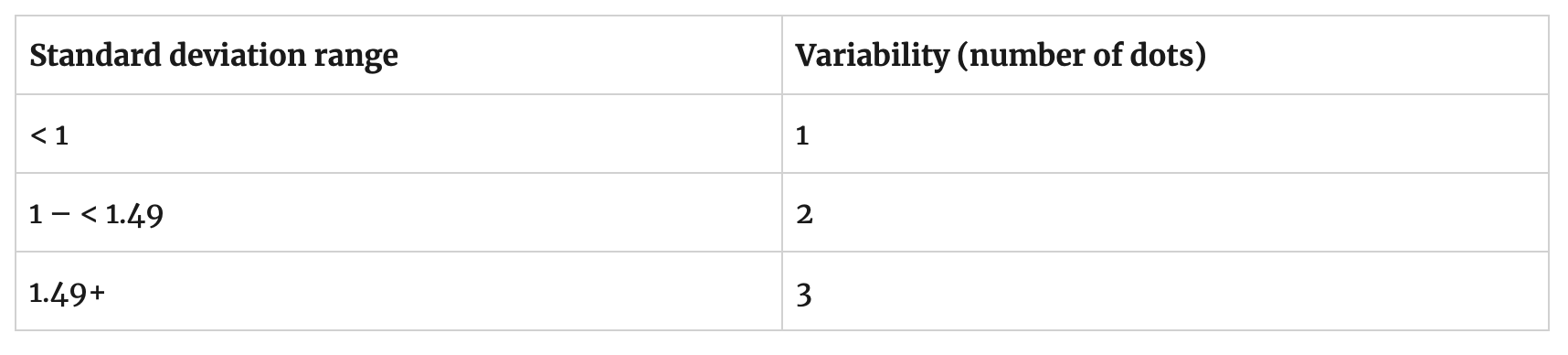
For the group and organization level, all votes across all entities are considered.
Overall average
The overall average is the number that appears in the center of the Insights canvas. This number is calculated by averaging the scores from each Practice. So using the scenario above and averaging the nine votes gets a score of 2.11.

Note that this number is rounded to the nearest tenth for display in the middle of the Insights Canvas.
Group/Organization level
At the group and organization level, all votes across all entities are averaged.
Business Outcome level
The Business Outcome level is calculated the same way as the Overall Average except that only Practices that are linked to the Business Outcome are included. Below is a list of the three Practices and their linked Business Outcomes.

Also, remember the averages per Practice that were calculated. Here they are for reference:

To calculate the Time to Market Business Outcome score, average all Practices linked to Time to Market, which is Team Stability and Agile Planning. The table below shows the results for some Business Outcomes.

Group/Organization level
At the group and organization level, all votes across all entities are averaged.
Trends
Trend lines are the lines that connect the per-practice score dots on the Insights Canvas. These trend lines behave differently depending on which level of the organization is being viewed.
ENTITY LEVEL
The objective of LAI team trend lines is to show the incremental improvement from
First Assessment to Latest Assessment
Previous Assessment to Latest Assessment
Previous Previous Assessment Latest Assessment
This approach shows how much improvement has been captured since the first assessment, and how the team is trending in its last three assessments.

A maximum of four trend lines are shown.
The trend lines are the date of the very first assessment taken and the dates of the three most recent assessments taken.
The trend lines show the latest score for each practice that is on or before the assessment date.
The first assessment trend line is always displayed so you are able to measure the amount of improvement seen since the first assessment baseline was established. The three most recent assessments allow you to see the most recent changes.
Examples
A team took 2 assessments on 7/6/2020, 3/4/2020
Trend lines: 7/6/2020, 3/4/2020A team four took assessments on 7/6/2020, 3/4/2020, 11/15/2019, and 6/4/2019.
Trend lines: 7/6/2020, 3/4/2020, 11/15/2019, and 6/4/2019A team took six assessments: 7/6/2020, 7/5/2020, 7/4/2020, 7/3/2020, 7/2/2020, 7/1/2020.
Trend lines: 7/6/2020, 7/5/2020, 7/4/2020, 7/1/2020
GROUP/ORGANIZATION LEVEL
The objective of LAI group trend lines in our dashboards is to show incremental improvements for different periods of time. LAI focuses on three improvement periods:
First Assessment to Latest Assessment
Previous Assessment in a prior calendar quarter to Latest Assessment
Previous Assessment in prior calendar year to Latest Assessment
To achieve those objectives the following approach has been adopted. Each team's first assessment is bucketed into the first assessment line. The subsequent trend lines represent the latest assessment taken by the team "As of" the specified quarter. This approach allows you to compare the first assessment (of all teams) to the different points in time (quarters) at every level of the organization. We have learned this is the best way to show trends given the variability of frequency that teams take assessments in different organizations. It would be misleading to compare two trend lines with differing number of teams - Q3 with 20 teams and Q4 with 10 teams just because 10 of those teams did not take an assessment in Q4. Instead, we show the aggregate of all team's first assessment and how their latest assessment aggregate has changed over points in time.

A maximum of four trend lines are shown.
The four trend lines are displayed/not displayed in the following order:
First Assessment – Include the first assessment taken for each entity, regardless of date the assessment was taken. This trend line is always labeled as ‘First Assessment’.
Last Assessment – Include the latest assessment taken for each entity, regardless of the date the assessment was taken. If this is the same data as ‘First Assessment’ then do not show the trend line. Label it as the latest calendar quarter a response was received (for example, 2020 Q3).
Previous Quarter Assessment – Include the latest assessment taken for each entity that has a latest date of the last day of the calendar quarter before Last Assessment. If this is the same data as ‘First Assessment’ or ‘Last Assessment’ then do not show the trend line. Label it as the latest calendar quarter a response was received.
Last Year Assessment – Include the latest assessment taken for each entity that has a latest date of the last day of the previous calendar year before Last Assessment. If this is the same data as First Assessment or Last Assessment or Previous Quarter Assessment then do not show the trend line. Label it as the latest calendar quarter a response was received.
The First Assessment trend line is always displayed so you are able to measure the amount of improvement seen since the First Assessment baseline was established. The Last Assessment trend line shows the latest responses to know where you are today. The Previous Quarter and Last Year assessments provide a good representation of recent improvements.
Examples
A group of 3 entities – each entity took one assessment on 3 different dates – 7/4/2020, 5/4/2020, 11/12/2019.
Trend lines: First AssessmentA group of 3 teams – two teams took one assessment – 7/4/2020, 5/4/2020, the other one team took two assessments – 7/3/2020, 5/12/2020.
Trend lines: First Assessment, 2020 Q2, 2020 Q3A group of 3 teams – two teams took one assessment – 7/4/2020, 3/4/2020, one team took two assessments – 7/6/2020, 1/4/2020.
Trend lines: First Assessment, 2020 Q1, 2020 Q3A group of 3 teams that took assessments for every quarter in 2020 and every quarter in 2019.
Trend lines: First Assessment, 2019 Q4, 2020 Q3, 2020 Q4A group of 3 teams that took assessments for 2020 Q1 and every quarter in 2019.
Trend lines: First Assessment, 2019 Q4, 2020 Q1